Showing posts with label original art. Show all posts

Monday, November 11, 2013

Gallery of Mo: First Mo'trait Request

Mo'trait #1
Prismacolor marker and pigment liner on paper.
2013


I wanted to share my first finished Mo'triat request from the Gallery of Mo.  This particular portrait will soon be shipping out acorss the pond to the United Kingdom to a sweet contributor, Keshia.  I've got one more portrait on deck of my good friend's father and three more opportunities to create portraits with mustaches for the Gallery of Mo project all during the month of November.  


Would you like an awesome portrait of yourself with a mustache drawn by me?  Or by another fabulous artist?  Sign up and contribute to the Gallery of Mo today!


Spread the word, spread the awareness, and spread the art!

Saturday, November 9, 2013

Volunteering Artwork: The Gallery of Mo

"My Favorite Scarf (self portrait)"
Self portrait with mustache created for The Gallery of Mo
Prismacolor marker and pigment liner on paper.
2013


I signed up to be an artist to help create some portraits of people with mustaches on them as a part of the Gallery of Mo for the month of November.  What is the Gallery of Mo and what's up with mustaches and November all of a sudden?  November has become dedicate to mustaches and raising awareness and funding for prostate and testicular cancer. Movember supports programs focuses on awareness and education of men's health as well as living with or beyond cancer or mental illness.  Thus re-creating November into "Movember."  


Would you like a self portrait from an awesome artist with a mustache on it?
Here's how you can one and participate in this fundraiser:

1. Visit www.galleryofmo.com

2. Select an artist who is participating based on their created self-portrait...with mustache (like mine above)

3. Upload a photo of yourself that you would like made into a artistic creation…with a mustache

4. Donate however much that artist is asking to commission a portrait for the fundraiser (some artists ask for different prices based on how they create their portriats, how much time it takes them, how much they would like to help donate to the fundraiser, and things like materials;etc.)


I plan on mailing the original illustration of requested mo'triats that come my way, if it's requested.  I'm also excited to share that I have had two mo'trait requests with one in the works and the other completed, scanned, and shared with the recipient.  This project has been pretty fun and very rewarding…and we're only about the first week into the month of November.  

I have to say, reading the feedback from the first mo'triat request I received from the United Kingdom was truly uplifting!  Even though at times I felt a little like I was creating  a caricature (maybe because of the mustache?), it was still a great experience to create a piece and have such positive feedback.  I've got one in the works, of one of my good friend's fathers, and three more empty slots to create some more mo'traits!   

Also, if you'd rather have another artist create your mo'triat in a different style, there are a myriad of others willing to create one for you.  You've got until November 30th, 2013 to request a self portrait with a mustache, a mo'trait!  Get on it!

Thursday, November 7, 2013

New Illustration: Wise Picea (pines)

"Wise Picea (pines)" 2013
Prismacolor marker and pigment liner on paper


Yes, this illustration is a little different from what I normally create.  It was originally created to submit for a local call for art at the Gallery at the Syracuse Tech Garden.  Unfortunately, this piece did not make the cut.  However, that doesn't mean I won't try and submit it to future calls for art and/or try and get it exhibited in another gallery setting.  "Trees: Symbols of Powerful Experiences," will be exhibiting November 14-December 31st 2013 with the opening reception on November 21st 2013 @ 5-8pm.  The Gallery will be open Monday-Friday 9-4pm.  
 

I'm still an emerging artist and there's still plenty of room for growth, acceptance, rejection, and new opportunities.  I try and apply my work, or create new work for a many opportunities as I can physically can in between working my retail job and living my life (like cooking good food, reading, running, shopping;etc.)  I strive to continue to create my work and continue to apply to exhibitions to simply get my work recognized.  I am determined to be a successful artist with my illustrations and my re-purposed sculptural/installation work.

What can I say?  It's a rollercoatser, like most of life is.  Sometimes I feel on top of the world and so joyful and proud of my work.  Other times I feel frustrated, defeated, and disappointed; however that doesn't stop my momentum.  I cannot say enough how I love simply just making things with my hands; creating new art and cooking good food.  

Now, back to the illustration.  I've been wanting to create an illustration that essentially pays homage to both my deceased grandfathers, who both cultivated enriching experiences within the Adirondacks.  I wanted to create an illustration that would remind me of the times spent in the woods with each grandfather and my family, and something my family would aesthetically appreciate in their home.  

Donald, my maternal grandfather, was a New York State Conservation forest ranger for over half his life.  He would even check fire towers on various trails in the Adirondacks in the earlier experiences of his career.  Mario, my paternal grandfather, was an avid fisherman and camper and influenced a lot of my own camping experiences still I was an infant.  I associate both my grandfathers with the love and appreciation I have with this great forest that was practically in my backyard growing up in Gloversville, New York. ( I was literally less than 10 minutes away from the blue line of the park.)  I have represented both of them with their first initial on each side of the piece.

The illustration also depicts the view from the top of Whiteface Mountain in Wilmington, New York; specifically depicting Lake Placid in the background.  I have specifically revisited this location with my family many a time; literally driving up the mountain road (it was paved in the 1940s) in one of our Chevrolet station wagons. (I'm proud to say we've been a station wagon family for generations).  
The area is magnificently beautiful and is great for camping, fishing, swimming, and hiking.  I have so much love for that protected woodland and the memories and experiences I have within the Adirondacks.    

Tuesday, September 24, 2013

Mural Painting


[detail of] Untitled mural (pink hair) 2013.
Acrylic and latex paint on plywood. 4 x 8'


I've had a busy stretch of days starting on Friday September 13th 2013 (my last blog post) involving a lot of driving with my car (and it's loud exhaust) as well as the death of a close and dear family member.  I've been home to be with family for a good chunk of days and have otherwise been entangled in life's responsibilities.  My busyness will continue to keep up the consistency until the weekend with an early trip back to Buffalo, New York to pick up "La Petite Gateau" from 464 Gallery, a 4-hour managers meeting at work, and a long closing shift,  but I'll make it through it.  Luckily, I'll be able to enjoy  a small holiday to Delaware with Gregory, his sister, and brother-in-law to a brewery tour and then stress over the 10K run I signed up for.  Eeek!

The photographs above were taken at the I <3 Utica Music and Arts Fest/Greensfest on Saturday September 14th 2013.  Overall, it was fantastic day of creating art publicly (a very new thing for me), talking with other artists, meeting new people, and being a part of community festival.  I painted alongside another amazing artist in the art collective, Project U Arts, for about 7 straight hours (with the exception to use the indoor plumbing, get water, wash brushes, or clean paint off of myself).  It was truly a great experience.  

I was stressing over what to paint for a couple days, because of the large size of plywood I would be painting on.  The content wasn't anything new...I do love drawing ladies with detailed coiffures, but the scale certainly was!  Between you and me, I really sort of just went with things and simply just started painting.  If I had more time to dedicate to the mural, or the space to house it, I would have enjoyed adding layer and layers of more detail.  Also, though the photos may not depict it, the plywood was not all smooth to paint over which added more time to it all.

Unfortunately the murals were only up during the time of the festival at Mohawk Valley Community College from about 10-6pm.  They are currently nestled safely in storage at an artist residency called Sculpture Space  also in Utica, New York for the time being.  I've also donated my mural to a skatepark in Canastota, New York, because of it's size.  Maybe my mural will inspire a skater or bmx girl.  I thoroughly enjoyed the community experience of all while doing something I absolutely enjoy doing; creating art.  I'm very pleased with my completed mural and look forward to being able to work and paint at that scale again.  

Thursday, September 12, 2013

The long drive to Buffalo

"La Petite Gateau" 2010-2013.
Prismacolor marker and pigment liner on paper. 14 x 17"

Yesterday I made the 2 1/2 hour drive (one way that is) to Buffalo, New York with this illustration framed and wrapped next to me on the passenger seat.  I dropped it off yesterday afternoon at 464 Gallery for the 2nd Annual Vision Art Awards (same competition as Online People's Choice Awards. Basically anyone can vote online for your work or anyone else's anonymously and then the votes are tallied and voted again by a couple curators or art professors (most likely volunteering) for the actual show.

Out of the three illustrations I posted about last, this one seemed to be the best-liked by the judges at 464 Gallery (although the Grecian-looking girl holding absinthe had the most "likes" via Facebook) and won "Honorable Mention" for the show.  Though I am a little disappointed that my illustrations didn't win a solo-exhibition in this small gallery, I am very grateful for the chance to have my work in the show and be recognized none the less. It's another show to put on my resume and it's a new city that will get to see a sample of work!  Win-win!

It was a little scramble to get this illustration in a proper frame and have everything be perfect.  I ended up taking the actual illustration in and out of the frame at least five times, because every time I'd put it in, set things evenly, close the backings on the frame and turn it over there'd be some sort of fuzzy, speck of dust, or something trapped between the inside of the glass and the illustration itself!  

The last exhibition I applied to, Greg and I were in the backseat of my Mercury Grand Marquis busily trying to put the selected illustration and matting in the frame before dropping off the piece to the designated gallery.  There's always some sort of frantics and frustration trying to put everything together as fast as you can, to drive to piece over to the gallery all before the deadline.  Oi!  I know I'll laugh about all these stories down the road at least!!

I've got a bust weeked ahead of me and a lot of artistic opportunities coming my way!  I'll try and keep this blog posted with more of what has been going on.  Cheers!

Sunday, August 25, 2013

New Illustration: Melt

"Melt." 2013
Prismacolor marker and pigment liner on paper. 5 x 7"

Started this about a week ago, but once again coloring the piece halted my progress for a bit.  I'll honestly say I can be slow when it comes to coloring an illustration trying to carefully choose each color and making sure it compliments the next. 

Each individual illustration I create is hand-drawn and hand-colored.  Hence, making the decision of what colors to use and the physical application of a color very important.  Whatever mistakes or accidental marks I make, espeically if it's near completion, are permanent.  When it does happen I have to adapt that mark into the piece or try and mask it to the best of my ability.  Sometimes it isn't too bad while other times it can throw a wrench into everthing.  These smaller illustrations I've been creating lately have just been for fun making them almost stress-free and silly.  

I love the combination of black raspberry ice-cream with chocolate sprinkles in a cone (my favorite being a big waffle cone).  It's delicious, iconic, and a delightful memory of getting ice-cream throughout my childhood.  I can still remember the first time my elementary school friend Desiree's mother introduced this combination while getting ice-cream at the local Stewart's (a gas station convenient store with an awesome ice-cream shop inside).  I've been loving it ever since.  

Thursday, August 1, 2013

New Illustration: Soup Loving Mouse

"Soup Loving Mouse." 2013.
Prismacolor marker and pigment liner on paper. 5 x 7"

Fresh from its completion is a new postcard-sized illustration! 
 I started this couple days ago while watching some favorite family films of mine.  Yes, I love watching children/family films especially if they're animated well.  And yes, I am guilty of watching them over and over (or as background when I'm drawing).  This little guy was specifically inspired by Pixar's Ratatouille.

Ratatouille is one of my favorite Pixar movies from it's content (cooking), to it's animation style, voice actors, and ultimate feel of the film.  It gives me a warm cozy feeling watching it.  The first dish Remi, the rat, helps with in the Parisian restaurant is a soup (specific kind unknown to the audience).  I, too, have quite the fondness for the comfort that both making and easting soup entails...so I created this little piece.  
Who doesn't get all warm inside with anticipation of a hot mug of homemade soup? 

Monday, July 29, 2013

New Illustration: Eye Flowers

"Eye Flowers." 2013.
Prismacolor marker and pigment liner on paper. 5 x 7"

I'm still working on the last major illustration, "Frisco," and the last I've updated on this blog.  The inking is almost finished, though I've been taking my sweet time to add color to it.  As silly as it may sound, sometimes it's intimidating to add color to a piece, at least for me.  Most of the time if you start adding a specific color to an area of the piece - you're stuck with it.  There are exceptions where I can add a darker color over a lighter one changing the feel of an illustration.  I was able to do that with "La Petite Gateau," between the original to the completed, layering deco blue over the original mint/tea green in the background. 

I drew and colored the piece above, "Eye Flowers," as an attempt to create a quick piece with the same passion and detail as a larger illustration.  This postcard sized illustration is a trial to see how I like creating smaller works.  My goal is create more spontaneous works like this that don't take days to complete (I am a slow, detailed orientated artist when it comes to inking/coloring).  
Like a good amount of my work, this was spontaneous and fanciful! 
 
-    -    -    -    -    -    -    -    -    -    -    -    -    -    -    -    -    -    -    -    -    -    -  

Someday in the future I will have prints to sell of my work (my goal is by the end of 2013).  I really, really want to sell my prints online (when I have prints made).  More importantly, I want to share my work with friends and those around me who support and motivate my work.  

I've started to look around locally for pricing, and most important test samples of my work printed.  I know it's going to be harder than I realize to find the perfect print + paper that best mimics the colors and mediums I use. 

Sunday, July 14, 2013

[Still] In Progress: Illustration (Frisco)

"Frisco" (still in progress). Prismacolor marker and pigment liner on paper. 
11 x 14"

Another in-progress shot of the illustration I've been working on most recently.  I've been adding a little more work here and there and then leaving it to rest for a day or two.  Weird cycle, I know, but we're all a little odd here.  I was actually quite antsy to start coloring it and have just begin adding layers of markers to blend her skin tone.  

I thoroughly enjoy experimenting with layering various colors of the Prismacolor markers as well as creating small color samples to see what colors I wish to use and mix.  Markers aren't just for children in my mind and I have no qualm that they've become my favorite medium.  I'm not quite sure what I'll do for the background just yet.  For some reason, I keep thinking of putting strawberries; like a wallpaper.  Maybe I just have berry picking on the brain.   

Monday, July 8, 2013

Old art found

Untitled (long hair). 2011. 4 x 6"


Yesterday, I went through a wooden crate of filled with sketchbooks dating between 2006-2012 for some inspiration and insight.  I was shocked to find so many old drawings and finished illustrations still attached to the original sketchbook they were created in.  I recognized most and have them scanned and saved on my computer, but had forgotten where I had physically left them last.  Then, there were some I had honestly forgotten I had drawn or half-started.  All in all, it was an uplifting experience to be inspired by one's own past work and become reacquainted with it again. 

These newly discovered drawings (some half-finished) have since been scanned and added to my website.  Above is a peek of what has been newly added to Driptique.  
Check out the latest additions!

Saturday, July 6, 2013

In Progress: Illustration (Frisco)

"Frisco" (in progress). Pencil and pigment liner on paper at the moment. 
11 x 14"

The photo above is an in-progress snippet of the latest illustration that I've been working on.  I wasn't sure how I felt at first, and felt she was a little dull in content; i.e. not having drips, fruit, or confectionery delights on her head.  However, this afternoon's progress held my interest, and reaffirmed my faith in the direction of the piece, when I started inking her locks of hair and adding detail.  

I've set the illustration on the coffee table, in the living room I share with Greg, to look at the progress thus far and let it settle.  I couldn't help but think of the song "San Fransisco" by Scott McKenzie while looking it over. "...For those who come to San Fransisco/
Be sure to wear some flowers in your hair..."  I do enjoy the flowers, though they were sort of a last ditch effort to put "something in her hair" once I started inking the strands.  It still has a long way to go and holds much room for potential.  
Keep you posted!

Monday, July 1, 2013

Sketchbook look: Girl with black earring

Untitled (girl with black earring). 2013.
Pigment liner on paper. 6 x 8"


 This is a scanned doodle from my 6 x 8" sketchbook that I finished a little bit ago.  No real direction, but I did try and style the eyes a little differently.  Maybe a bit more realistic (as far as illustration goes...)?  It's the first of July and the first of a new month.  Cheers to a month commencing with new found motivation, new goals, and a more creativity! 

Saturday, June 29, 2013

New Illustration: La Petite Gateau

"La Petite Gateau" 2010-2013.
Prismacolor marker and pigment liner on paper. 14 x 17"


I am SO EXCITED that I finished this piece after work a couple of hours ago.  Over the course of five days, I transformed the illustration in the post below; coloring over the original background color, inking lines over again as well as creating new ones for more detail.  

The background is a layer of avocado green with a layer of deco blue (my favorite).  I'm not the greatest in photographing my work (I need one of my college photo-friends to re-shoot my portfolio), but I try my best at digitally documenting my work with the tools I have.

I'm personally really pleased with the progress I was able to make to the illustration, which has now been updated to my website, Driptique..  I'm really trying to ride this creative wave and maintain positive energy with what I've been making in the remaining part of June.  Sometimes my creativity, is an arid well of inactivity and frustration fueled by self-criticism, personal expectations, and the tolls of working in retail, and sometimes it's a consistent stream of inspiration, focus, good energy, and good work.  I'm beginning to make the most out of my summer artistically. 

Friday, June 28, 2013

Untitled illustration from the past

Untitled (until completion). 2010-2013.

I've mentioned in past posts, that sometimes I start a drawing or illustration and just leave it due to lack of inspiration, boredom, and/or a bust lifestyle/work.  Rarely will I go back to them and sometimes I'll re-create them fresh with a new style; an expample of this is "Mademoiselle Spider" after the original was ruined. However, after looking through some older illustrations, unfinished drawings, old fashion drawings and sketches from college courses...I found this piece.  I took this photograph yesterday morning to show how I left it sometime in 2010, so that I can show what I've added to it in 2013.  

I'm not finished with the progress of adding to a piece I started three years ago, but I can say that I'm really pleased with how it's turning out. I'll also state that I am a glutton for tedious effort put into my work; i.e. going over the same lines three times to get the right thickness and look.  It's what I love to do, though the piece may not reflect all the time gone into it.  Hopefully, tomorrow after work I'll be able to finish and photograph the before and after.

Wednesday, June 26, 2013

New Illustration: Stars


"Stars." 2013 (in progress)


"Stars." 2013.
Pigment liner on paper. 6 x 8"

This post would have been titled with "sketchbook look," however this particular illustration took up more time than I had originally anticipated.  I started this yesterday in my small 6 x 8" sketchbook with small refresher breaks in between, which usually involved watching something found streaming on Netflix (lately it's been Star Trek: DS9). 
 

I liked where the drawing was going and indulged with the lines of the hair.  I've somehow drifted to drawing intricate coiffures or naturally unruly down styles of women's hair.  I don't put too much effort into my own hair and like to let it be naturally curly/wavy.  Of course, I've colored it, bleached it, cut it myself, as well as adorned different styles and accessories, like most women do.  Hair just holds this great potential of personality with the various styles, colors, and cuts it can be transformed into.   

Monday, June 24, 2013

Sketchbook Look: Curly girl

Untitled (Curly girl). 2013
Pigment liner on paper. 6 x 8"

I'll be finishing up my second retail job today and saying goodbye to packing, tagging, and merchandising previous seasons clothing at discounted prices for awhile.  Though clothing retail wasn't bad to work in, I am already taken in the home goods/furniture/fragrance retail.  I look forward to worrying about only getting to one job and actually enjoying my New York State summer.  Hopefully some tent camping, hiking, swimming, and running will be in my future in the next couple of months.

I drew this doodle (above) this morning while drinking my coffee.  The methods were the same as the last doodle and I tried to keep my thoughts free to the possibilites I was spontaneously creating in my small 6 x 8" sketchbook.  I'm not sure if I'll add to it, color it, or just leave it be.  As weird as it sounds, I sometimes like leaving my pieces unfinished as they are.  It's a unexplainable artistic fate for some of the pieces that I create.


Note: I hand draw these pieces and scan them (through an older scanner) to my laptop.  Sometimes the scans aren't perfectly ideal.  I didn't want to tear it out of my physical sketchbook and that's how it scanned with the spirals.  

Sunday, June 23, 2013

Sketchbook Look: Celestial moonboy

Untitled (Celestial moonboy). 2013
Pigment liner on paper. 6 x 8"

Believe it or not I don't draw and doodle nearly enough for what I should be doing.  I should be doing it a lot more for my sanity's sake and for my developing career.  Sometimes I'm my own worst enemy and stop when I've started a drawing or doodle that really isn't hitting my expectations.  As silly as this sounds, I simply just need to let myself doodle more. 

I started this doodle in a small sketchbook that serves as both a place to write any new recipes I am inspired by off the internet, and any other various things I think of.  My sketchbooks have been holding more words than drawings lately, but they still serve their purpose in holding potential future projects and artistic pieces in general.  Gregory and I have been watching a lot of Star Trek: Deep Space Nine lately in the evenings (streaming via Netflix) and this drawing is a little inspired by of Odo, a shape-shifter on the show.  I'm beginning to like his character more and more as the series develops.  

When I completed the face (I always start with the eyes and then face first) I didn't know where to take the drawing....or what to make him into.  I decided to make him into a general "alien" looking man, though I thought about making him into a caterpillar or moth-looking man.  The moon was created with a little "Starry Night," by Vincent VanGogh, in mind.  I didn't have a "set" end result for how I thought this drawing should look like in the end.  I usually have an image in my mind of how I would like the pieces I draw or create to end, and sometimes I have no idea and "just go with the flow."  This was certainly a "let's see where this is going" piece.  

Now, the question comes down to color or not to color?

Sunday, June 16, 2013

Sketchbook Look: lavender girl


There's a correlation between my blog absence and when I started working another part-time job.  Well, I've decided to leave that second retail workplace for a better summer, to find my focus with my art again, and for a little more freedom (even if that means a little less income to work with).  Honestly, I feel as though I've hardly created anything this year and it's almost half over.  I'm making the decision to change that.

I drew this doodle on a lavender piece of scrap paper (about 3 x 5" dimension) and a thin black marker.  I'll admit I started it stealthily between customers and sizing new merchandise at my second job this afternoon.  I need to draw doodles more without caring about the outcome of the doodle.  Sometimes that's when some of the most interesting illustrations start from.   

Friday, March 1, 2013

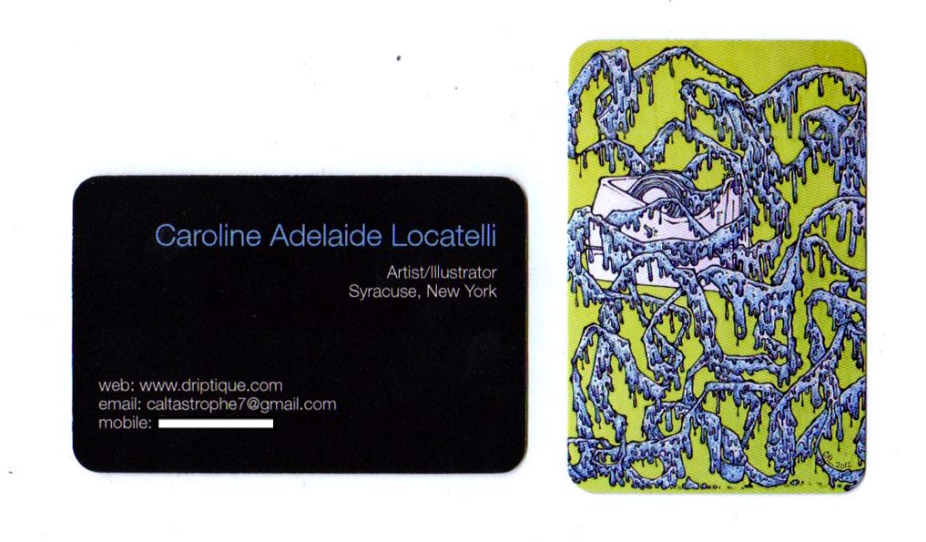
Arrival of new business cards.

THEY'RE HERE!!!!
(Yes, Poltergeist pun encouraged right here).
 
My new business cards finally came in the mail!  They actually arrived a little sooner than expected; I've just been a little behind on blogging about them.  

 I'm so excited and proud of how they came out!  They are saturated with color, glossy, little bits of awesomeness that I am finally proud to give away to friends, family, co-workers, and most importantly at exhibitions.  I was recommended to use Moo.com by a professional friend and one of my former fashion illustration professors, Amanda (one of my inspirations for independent artists/entrepreneurs).  I'm so thankful she recommended this site, because as you can tell I'm so happy with the outcome! 

Most people could whip up business cards no problem, I'm sure.  I definitely lean on the side of analog and prefer to do everything hand-drawn or hand-made.  As you can guess, I'm not all that computer savvy and it's not easy for me to "whip" something up using a computer.  Even those these current business cards are smaller images taken from photographs of my physical illustrations, I am simply over the moon for them! 
I certainly recommend Moo.com, if you're looking for a website to create stunning business cards for your business, profession, or craft. 

Tuesday, February 12, 2013

New year/new business cards

"Mademoiselle Spider." 2011
Prismacolor marker and pigment liner on paper. 24 x 19"
"Drippy Tape." 2012.
Prismacolor marker and pigment liner on paper. 14 x 17"

I've been meaning to re-order new business cards since summer of last year when I published my website.  Sure, it's been over half a year since I started putting "create new business cards" on my to-do lists.  I decided on two different illustrations on the front and my contact information on the back.  
Simple, yet striking. 

I admit some of the photographs I have of my illustrations are not the absolute best.  I would really like to have all my work professionally re-shot; especially two illustrations ("Epiphany (Lilith)" and "Mademoiselle Spider"-pictured above) that I had professionally matted and framed.  There's still a bit of glare on the photograph above that I'm just not content with.  I'll just have to badger one of my photo friends and arrange a time to meet up and shoot my portfolio. 

Anyways, I'm excited for the fresh start to the new year (yes, I know we're already over a month in).  I'm excited above my fresh new business cards, applying and exhibiting in new shows and venues, and especially to creating new art.